How to Make Great First Impressions with a Vcard
Make a great first impression with a digital Vcard. The best business card alternative for professional networking and easy contact sharing.

Updated: 07 May 2026 — expanded with first impression psychology, context-specific card strategy, and measurable outcome data.
The first impression you make at a networking event lasts about seven seconds. The first impression your business card makes lasts considerably longer — because it sits in someone's phonebook, inbox, or WhatsApp chat long after the conversation ended.
I have watched professionals give a confident, articulate pitch and then hand over a paper card with a blurry logo, a crossed-out phone number, and a Gmail address. The card undoes the pitch. Here is how to make sure your HelloVcard reinforces the impression you made — rather than contradicting it.
Why First Impressions From a Card Last Longer Than You Think
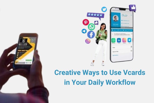
When someone saves your contact from a HelloVcard, they are not just saving a phone number. They are saving your name, your company, your designation, your photo, and — if you have set it up correctly — a link to your portfolio, your booking page, or your intro video. Every time they see your name in their contacts or their WhatsApp, the card impression resurfaces.
178 active HelloVcard profiles are live on the platform. The ones generating the most follow-through — the most contact saves, the most CTA taps, the most return visits — share a common characteristic: they are consistent, complete, and specific. The card looks like a natural extension of the professional behind it.
Element 1: A Headshot That Is Immediately Recognisable
The profile photo is the first thing a contact sees when they open your HelloVcard. It should be the same photo you use on LinkedIn — so that when they search for you after your meeting, the face they remember matches the profile they find.
Practical requirements: professional attire, neutral background, good lighting, recent (within 2 years). Avoid: group photos cropped to your face, casual photos from events, logos, or illustrations. The goal is immediate recognition — your contact scans your QR code and sees the same face they just spoke to.
Element 2: A Job Title Specific Enough to Be Remembered
Generic titles are forgettable. "Marketing Manager" tells a contact nothing about whether you are relevant to them. "Performance Marketing Manager — D2C E-commerce" tells them exactly what you do and for whom in four words.
The specificity of your title determines the quality of the contacts who reach out. A vague title attracts vague enquiries. A specific title attracts qualified ones. Across 11,380 tracked interactions on HelloVcard's platform, cards with specific, niche-targeted titles generate higher contact-save rates — the recipient knows immediately whether saving your contact is worthwhile.
Element 3: One Primary CTA That Is Unmistakably Clear
A first impression is wasted if the contact does not know what to do next. Your HelloVcard's primary CTA button should tell them exactly: "Book a 30-minute call", "View my portfolio", "Message me on WhatsApp", or "Save my contact."
Pick one. The contacts most likely to act are the ones given a single, clear next step. A card with five equally prominent buttons — WhatsApp, Calendly, LinkedIn, website, email — asks the viewer to choose, and most will choose nothing. One strong CTA converts; five competing CTAs confuse.
Element 4: Brand Colours That Match Your Other Touchpoints
If your HelloVcard uses different colours from your website and email signature, the inconsistency registers subconsciously as unprofessional — even if the contact cannot articulate why. Colour consistency is the fastest signal of intentional brand management.
Pull your exact hex codes from your brand guide or website CSS. Enter them directly into HelloVcard's colour customisation fields. This takes two minutes and produces a card that feels like an integrated part of your professional identity rather than a separate tool you picked up somewhere.
Element 5: A Tagline Under 12 Words
Below your name and title, HelloVcard allows a short tagline or bio line. Use it to state your value proposition in under 12 words. Not "passionate professional with 10 years of experience" — that is every card. Something like "I help logistics companies cut freight costs by 15-30%" or "Wedding photographer covering South India — available 2026."
Specific value propositions are memorable. Generic ones are invisible. If someone reads your tagline and immediately knows whether they need you, it has done its job.
Element 6: A Video That Does the Pitch for You
A 45-second intro video embedded in your HelloVcard is the most powerful first-impression tool available on any business card format. A recruitment consultant on the platform added one and reported double the conversion rate from new contacts to clients — because contacts who watched the video arrived at the first call already warm.
Record it on your phone in good natural light. State your name, what you do, who you help, and one specific result you have delivered. End with a clear invitation: "If this sounds relevant to your situation, tap the button below to book a call." Under 60 seconds. No production budget required.
Element 7: Social Proof Without Overcrowding
One or two social proof elements on your HelloVcard strengthen the first impression significantly. Options that work: a client logo strip (3-4 recognisable clients), a single testimonial quote under 20 words, or a metric ("47 projects delivered across 12 countries"). Options that hurt: a wall of text about your background, a list of every award you have ever received, or a portfolio of 30 images that takes 10 seconds to scroll through.
Edit aggressively. The contact who scans your QR code at an event has 15 seconds of attention to give your card. Use those 15 seconds to show them the one thing most likely to make them save your contact.
The First Impression Checklist — Before You Share Your HelloVcard
- Professional headshot — same as LinkedIn, recent, neutral background
- Specific job title — niche-targeted, not generic
- One primary CTA — clear, actionable, current goal
- Exact brand colours — hex codes from your brand guide
- Tagline under 12 words — specific value proposition
- Intro video — 30 to 60 seconds, phone recording is fine
- One social proof element — client logo, metric, or testimonial
- All contact fields complete — phone, email, website, company
- Card shared to email signature, LinkedIn, WhatsApp bio
First Impression Mistakes That Undo a Good In-Person Meeting
| Mistake | Why It Hurts | Fix |
|---|---|---|
| Logo instead of headshot | Contact cannot connect face to card | Upload professional headshot |
| Generic title like "Consultant" | Contact cannot assess relevance | Add sector and specialisation |
| Five CTA buttons | Contact makes no decision | Delete four, keep one |
| Wrong brand colours | Inconsistency reads as unprofessional | Enter exact hex codes |
| No video | Missed highest-impact opportunity | Record 45-second phone video |
| Incomplete contact fields | Recipient cannot save complete details | Fill every relevant field |
| Card not in email signature | 90% of contact exchanges missed | Add URL to signature today |
How to Set Up a First-Impression HelloVcard
Step 1: Create Your Account
Go to hellovcard.com/register and sign up free. No credit card required. Your account is active in under two minutes.
Step 2: Upload Your Headshot and Logo
Use the same headshot you have on LinkedIn. Upload your company logo separately. Both fields should be filled — headshot for recognition, logo for brand association.
Step 3: Write a Specific Title and Tagline
Replace your generic title with a niche-targeted designation. Write a tagline under 12 words that states your specific value proposition. These two elements determine whether a new contact saves your card or closes the tab.
Step 4: Set One Primary CTA and Add Your Video
Choose the single most important action you want new contacts to take. Set it as your primary CTA button with a clear, action-oriented label. Record a 30-60 second intro video on your phone and upload or link it. Publish your card — it is live immediately.
Frequently Asked Questions
How quickly can someone save my contact from a HelloVcard?
Under 10 seconds from QR scan to contact saved. They scan your code, the card loads in their browser, they tap Save Contact, and your full details write directly to their phonebook via vCard 3.0. No typing, no OCR errors, no friction. Across 11,380 tracked interactions, contact saves are the most frequent action taken after a card view.
Does my HelloVcard look professional on all phone screens?
Yes. HelloVcard profiles are mobile-optimised and render correctly on Android, iOS, and any browser-based device. The layout, colours, and photo all display as intended regardless of screen size or operating system.
Can I test how my HelloVcard looks before sharing it?
Yes. After publishing, open your card URL on your own phone. Check the headshot quality, the colour rendering, the CTA button placement, and whether your video plays correctly. Share it to a colleague for a second opinion before distributing it widely.
How often should I update my HelloVcard for maximum impact?
Update whenever something changes — new role, new number, new focus area, new CTA goal. Also review the card every quarter to check whether your tagline, video, and primary CTA still reflect your current positioning. A card that was set up 18 months ago and never updated is a missed opportunity at every scan.
Your card is the last impression you leave after a great meeting. Make it count — create your HelloVcard at hellovcard.com/register and have a professional, first-impression-ready card live in under five minutes.
Build your free digital business card at hellovcard.com/create and review plan options on the HelloVcard pricing page — professional features from ₹99/month.
What Neuroscience Says About First Impressions — and Why Your Card Extends Them
Research in social cognition consistently shows that first impressions form within seconds and persist for significantly longer than the initial interaction. The card you share after a meeting isn't a separate event — it's a continuation of that impression, either reinforcing or contradicting what the contact experienced in person.
A HelloVcard opens in under 2 seconds on any phone. The contact sees your headshot, your specific designation, and your primary CTA before they've had time to form a secondary impression. That 2-second load window is the extension of the in-person moment — a professional, structured, immediately navigable profile reinforces the impression you made. A paper card that gets photographed and forgotten, or a number typed into notes, does not.
The Three First Impression Killers on Digital Business Cards
A logo instead of a headshot: Logos create brand recognition for companies with established awareness. For an individual professional, a logo where a face should be creates immediate distance. The contact doesn't know your logo — they know your face. Use the headshot. Across our platform data, cards with professional headshots consistently generate higher save rates than cards using logos as the primary profile image.
A generic job title: "Manager", "Consultant", "Director" tells the contact nothing about what you actually do or why it's relevant to them. "B2B Sales Manager — Industrial Equipment, West India" tells them everything in five seconds. Specific titles improve recall because they give the contact a mental filing category for you.
Multiple CTAs competing for attention: Three buttons — WhatsApp, Call, Email, LinkedIn, Portfolio — create decision paralysis. The contact taps nothing because they don't know which one is the right choice. One clear CTA with an action label ("Book a 15-min call" rather than "Contact me") converts significantly better than a button grid.
First Impression Strategy by Context
| Context | CTA to set | Key card element | Share method |
|---|---|---|---|
| Conference / trade show | Book a follow-up call | Designation with industry + geography | QR code on badge / NFC tap |
| Sales meeting | WhatsApp direct | 45-second intro video | HelloVcard link in follow-up message |
| Online event / webinar | LinkedIn connect or portfolio | Professional headshot (recognisable on video) | Link in chat during event |
| Cold outreach email | Book a call or view case study | Credibility tagline with outcome metric | Link in email signature |
| Referral introduction | Portfolio or booking link | Intro video — establishes voice and manner | WhatsApp link from referrer |
How 11,380 Card Interactions Inform First Impression Best Practice
Across tracked interactions on HelloVcard, the pattern between card elements and engagement is instructive. Cards with intro videos see measurably higher return visits — contacts come back to watch the video after the initial scan, signalling that the video extended the first impression beyond the initial card view. Cards with a single specific CTA see higher tap rates than cards with multiple options. Cards with professional headshots see higher save rates than cards without photos or with logo-only images.
These aren't design preferences — they're behavioural patterns from 11,380 real interactions across 178 active cards. The first impression your HelloVcard makes is measurable, adjustable, and improvable in real time without reprinting anything.
How quickly should I share my HelloVcard after meeting someone?
Within two hours of the meeting is optimal. Context is freshest, the contact is most likely to save your details while they remember who you are, and the follow-up message positions you as organised and prompt. Waiting 24+ hours drops both the likelihood of the contact saving your details and the chance of them remembering the specific conversation your card is attached to.
Should my HelloVcard look different for different types of networking?
The card content stays the same — changing it per event creates maintenance complexity. What you change is the CTA, which takes 90 seconds to update. Before a sales-focused event, set the CTA to your booking link. Before a creative showcase, set it to your portfolio. After the event, revert or update to whatever drives your current priority. Same card, context-appropriate action every time.
What's Your Reaction?